These items are also grouped with appliance statistics in the Monitoring menu:
|
•
|
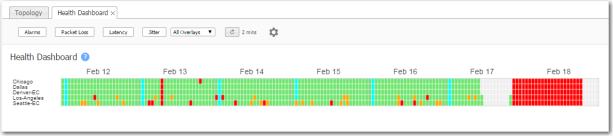
The Health Dashboard provides provides a high-level view of your network's health, based on the filter thresholds you configure.
 |
|
n
|
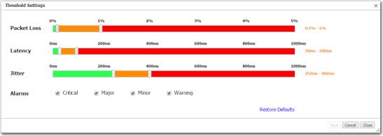
Filters are available for packet loss, latency, and jitter. For each, you can configure two thresholds. You can also filter for various levels of alarms.
|
|
•
|
Green = normal operation
|
|
•
|
Orange = marginal
|
|
•
|
Red = needs immediate attention
|
|
•
|
Aqua = warning (an alarm level)
|
|
•
|
Grey = no data available
|
|
•
|
 |
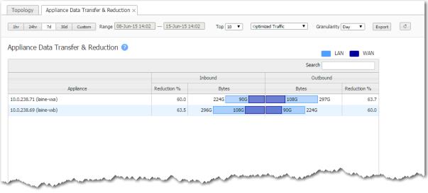
The Appliance Data Transfer & Reduction chart lists the top appliances based on the total volume of inbound and outbound traffic before reduction. It shows how many bytes the Silver Peak appliance saved when transferring data, aggregated over a selectable time period.
 |
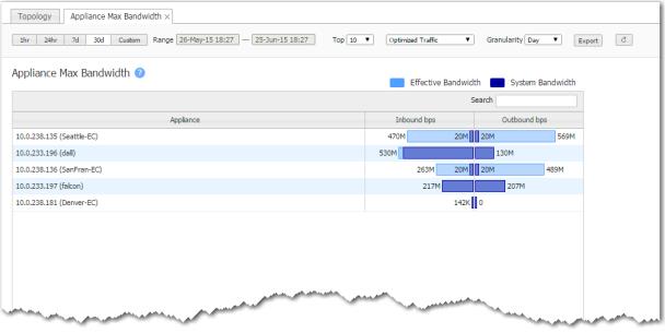
The Appliance Max Bandwidth chart lists the top appliances by the peak throughput (in either direction), within a selected time period. It compares the system bandwidth of the appliance to the effective bandwidth it's providing.
 |
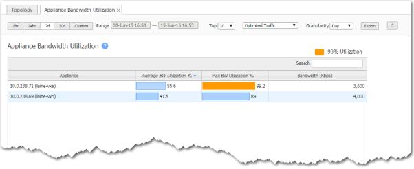
The Appliance Bandwidth Utilization chart lists the top appliances by the average percent of available bandwidth used. This helps you see if an appliance that is optimizing traffic is reaching its capacity.
To see if your data link is nearing capacity, refer to the Tunnel Bandwidth Utilization chart.
 |
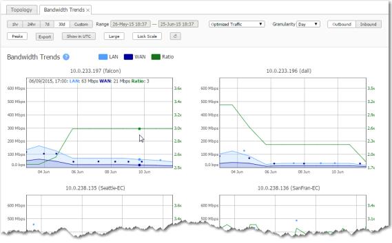
The Appliance Bandwidth Trends chart shows bandwidth usage over time.
 |
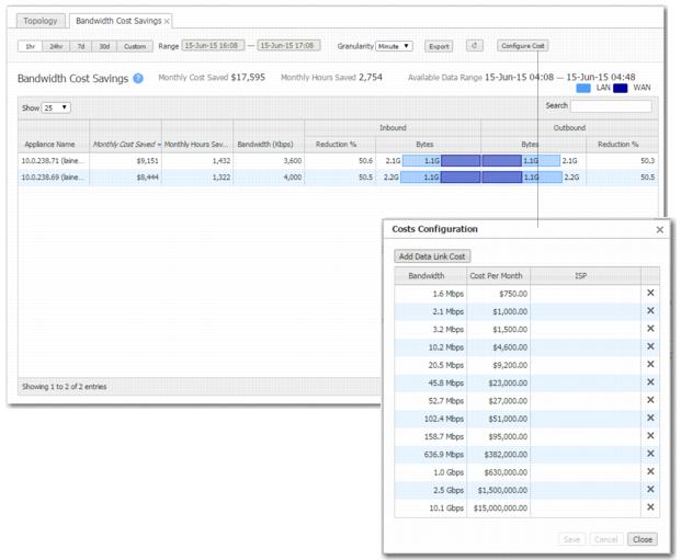
The Bandwidth Cost Savings chart shows how much money and time the Silver Peak appliances could have saved based on reduced bandwidth usage. The monthly figures are calculated by extrapolating the savings from the selected time range.
To view or edit the various data link costs, click Configure Cost.
 |
|
n
|
For the monthly cost savings, it subtracts the maximum bytes you could send without the appliance from how many bytes the Silver Peak actually sent, and multiplies the difference by the data link cost.
|
|
n
|
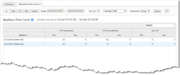
The Appliance Flow Count chart lists the top appliances according to which ones had the most flows within a selected time period.
When you filter on All Traffic, the Created and Deleted columns display the number of new and ended flows for that same time period. The Max column value is from a one-minute window within the time range.
 |
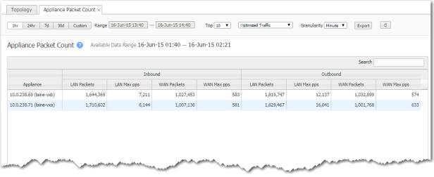
The Appliance Packet Count chart lists the top appliances according to the sum of the inbound and outbound LAN packets, showing how much traffic was sent.
 |