|
n
|
|
n
|
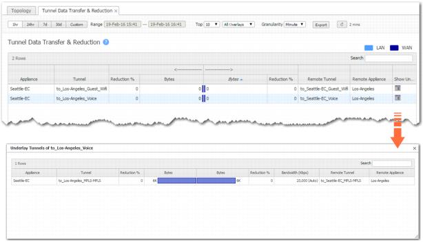
The Tunnel Data Transfer & Reduction chart shows which tunnels are sending the most bytes -- that is, the tunnels that are the most active.
 |
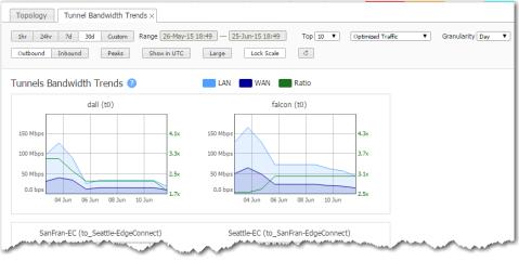
The Tunnel Bandwidth Trends chart shows chart shows tunnel bandwidth usage over time.
 |
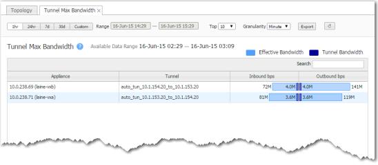
The Tunnel Max Bandwidth chart lists the top tunnels by the peak throughput (in either direction), within a selected time period. It shows how quickly data could have been sent through the tunnel.
 |
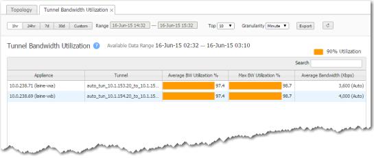
The Tunnel Bandwidth Utilization chart lists the top tunnels by the average percent of available bandwidth used. This helps you see if a data link is reaching its capacity.
To see if your appliance is nearing capacity, refer to the Appliance Bandwidth Utilization chart.
 |
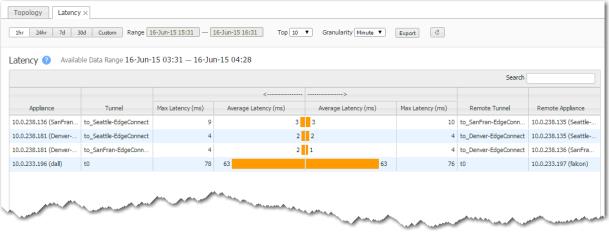
The Latency chart shows which tunnels have the most transmission delay, generally as a result of congestion.
 |
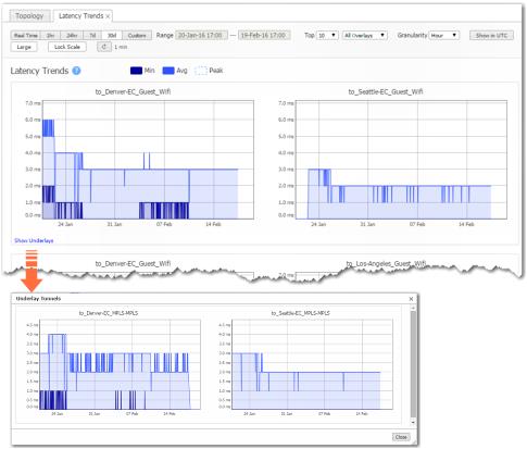
The Latency Trends chart shows tunnel latency over time.
 |
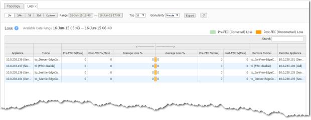
The Loss chart shows which tunnels have the most dropped packets.
 |
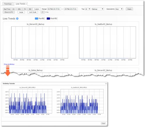
The Loss Trends chart shows tunnel packet loss over time, before and after Forward Error Correction (FEC).
 |
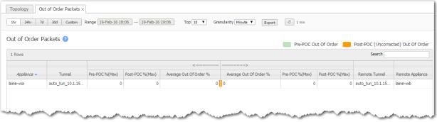
The Max Out of Order Packets chart shows which tunnels receive the most packets out of sequence relative to how they were sent.
 |
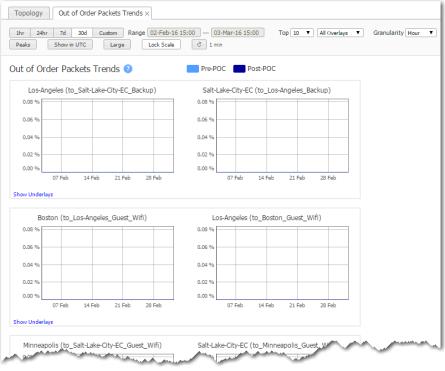
The Out of Order Packets Trends chart shows tunnel packets out of order over time, before and after Packet Order Correction (POC).
 |
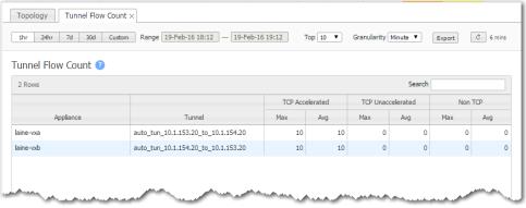
The Tunnel Flow Count chart lists the tunnels with the most flows, on average. It differentiates flows into TCP (accelerated and unaccelerated) and non-TCP, and also shows peak values.
 |
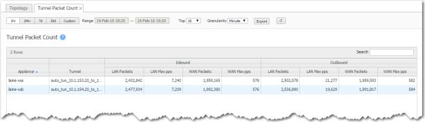
The Tunnel Packet Count chart shows which tunnels sent the most packets.
 |
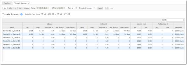
The Tunnels Summary summarizes tunnel statistics — including reduction, throughput, latency, and packet loss.
 |